 Loading... Please wait...
The Best Colors To Use In Small Homes
Posted on Feb 20th 2018
The Best Colors to Use in Small Homes
- By Trendir
- Posted By Marika 2-20-18
If you have a smaller home, you may think you are bound to only using white and beige shades in order to not make it appear larger. However, there are multiple different colors you can incorporate into your home that will give you the appearance of a larger residence. Here are a few options of different colors you can use in a small home.
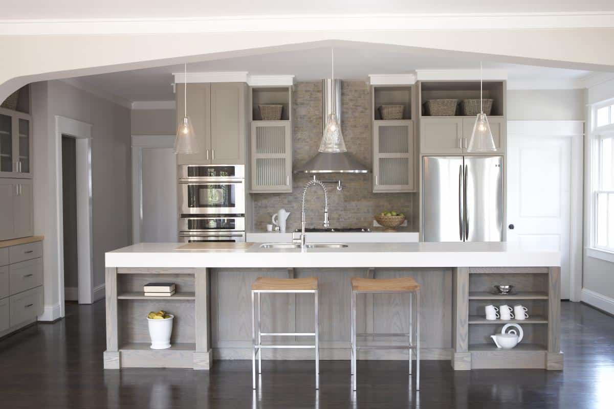
Taupe
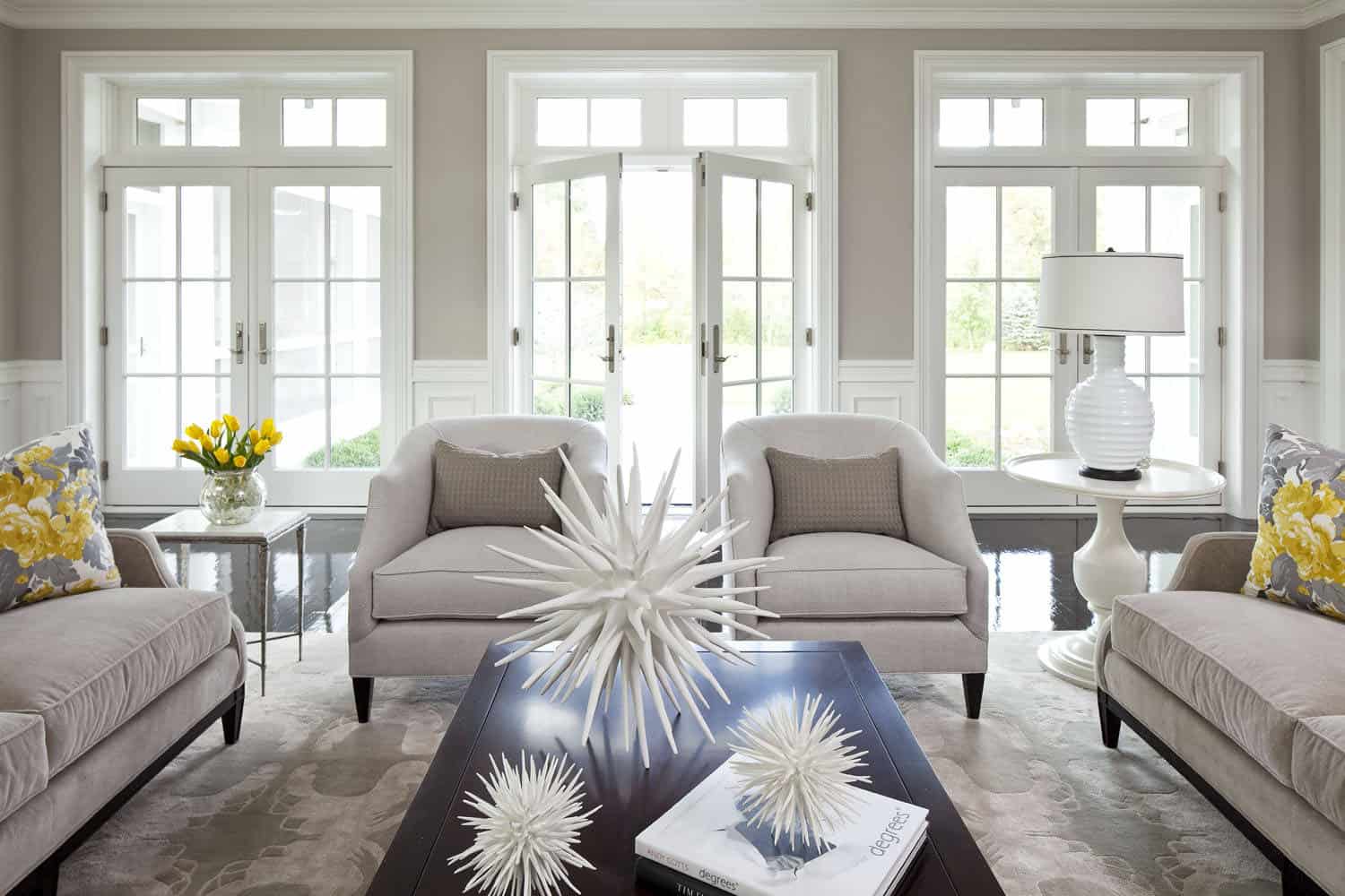
Taupe is an excellent overall color for any size home. It is chic, trendy and adds a dimensional feature to the living space. This color works best in the kitchen, home office, or even in the living room. The key is to pair it with other light hues and to allow the room to have lots of natural light.
Hazel
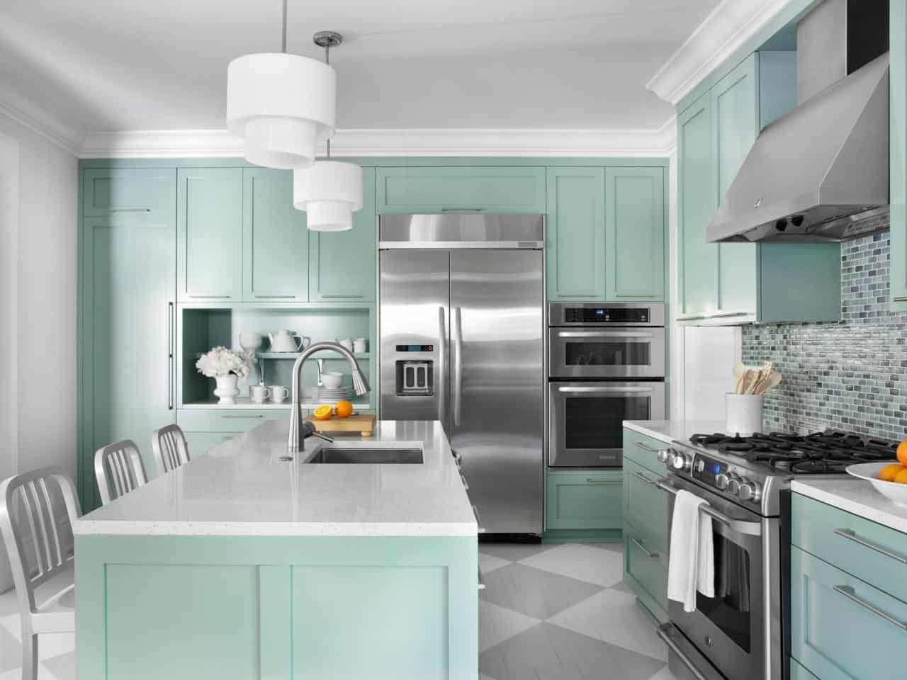
This greenish-blue color is not only beachy but its classic as well. The color plays well with multiple different hues which is always a plus. Pair it with bold, richer shades for a contrast that is hard to miss. This shade works well in the foyer, kitchen, or guest bedroom.
Griffin
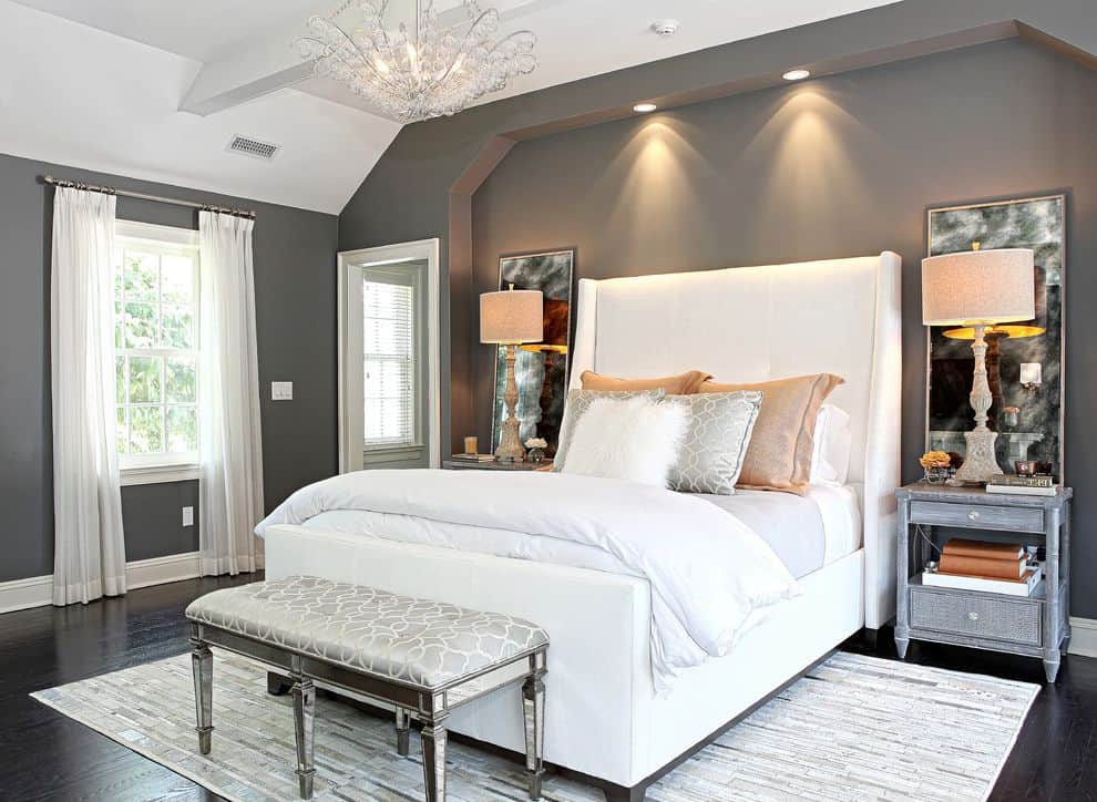
Griffin is best described as a dark chocolate shade with hints of gray and taupe. The color is a commanding hue that adds richness and dimension. The key to working with this color is pairing it with creamy softer shades. Additionally, you want to only use this color on an accent wall for the best outcome. This color is perfect for the library space or even the living room.
Pastel Blue
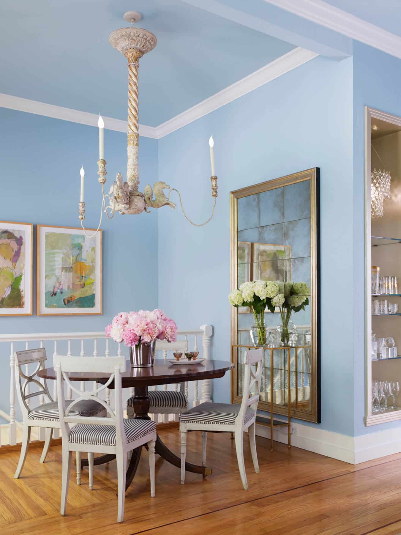
There is nothing quite like adding shades of pastel blue to a home. The notoriously beautiful color works well in any space it is placed in, not only that but the color is extremely pliable. Choose a lighter shade of pastel blue for a softer take or a darker version of this shade for a richer, bolder feel. This hue works well in a bedroom or even in the bathroom.
Gray
The key to working with gray hues is having bright, crisp white all around the space. The crisp white shades instantly lighten this hue and give it a charming effect. You want the gray to feel soft and charming not stuffy and cold. Choose a gray hue with a purple or blue undertone. This is an excellent overall color which means it will work well in any room in the residence.
Oriental Red
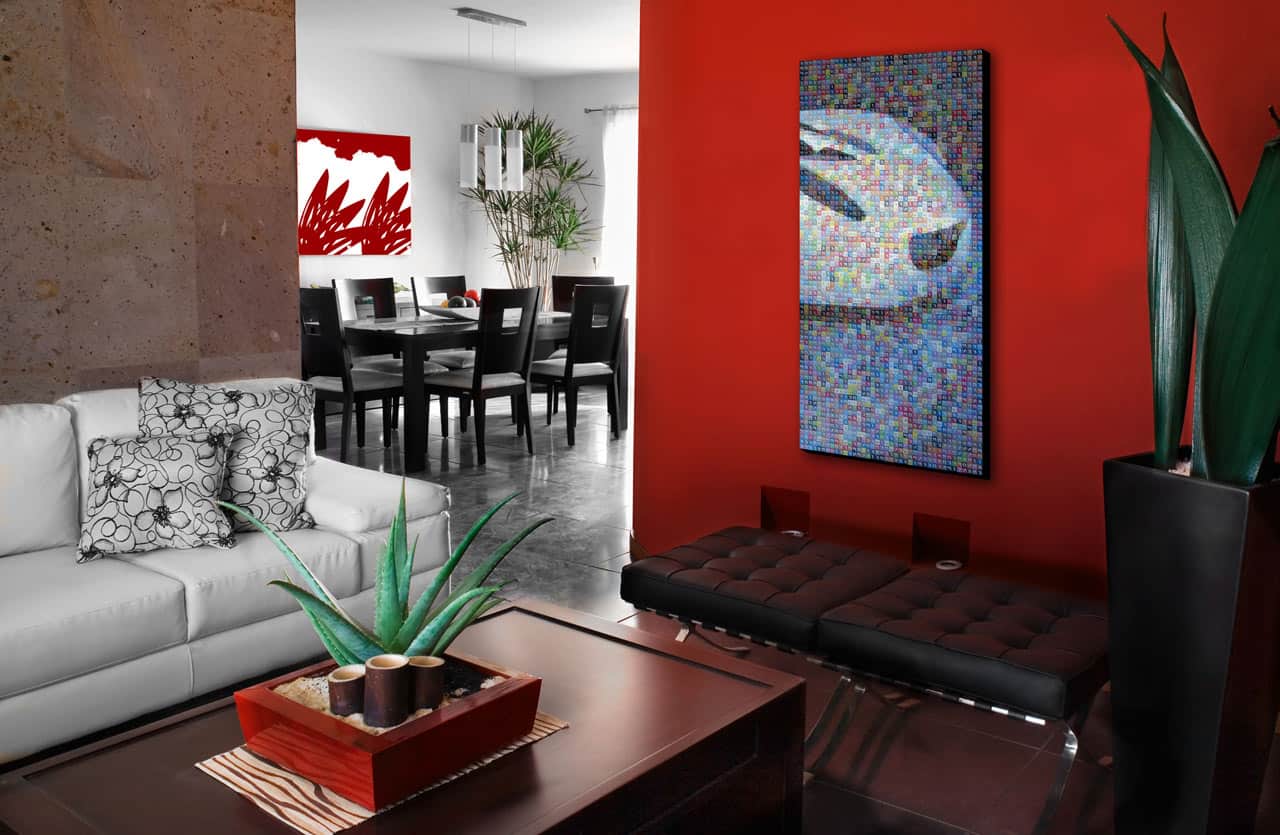
Yes, you read that correctly red hues work well in any space of a home. The reason being they are rich and fun with a twist of modern. The key to working with red hues is knowing which shades work best and where. You want to use hues that are less bold and have richer undertones. Doing so will bring life to the space while still being multi-dimensional. Pair this shade in all rooms with great lighting.
Deep Purple
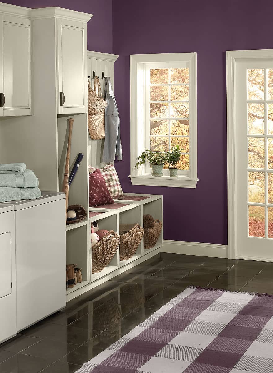
This regal shade is everything you have dreamed of and more. The hue is not for the faints of hearts or for the homeowner who wants to have a simple space. This color commands your attention as soon as you enter. It also shifts colors depending on the lighting you use. The brighter the lights the darker the color will appear. However, if you use bright lights the hue will significantly lighten up.
